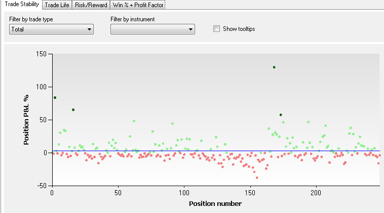
Charts the position profit vs. position number for all trades.
The point of this graph is to analyze how are the trades clustered around the average trade line, which is represented by blue horizontal line. If the trades are clustered, then the coefficient of variation of the average trade is low, suggesting that the average profit per trade is stable. Instability, as identified by wide dispersion of profits on the Y axis, is a warning sign.
In dropdown lists you can create breakdowns by the type of position (Total, Long or Short) as well as to display the values in dollars or percentages.
As with other performance visualizers, mousing over their elements will reveal additional details. The tooltip show the position number and its profit. When a trade is an
outlier, i.e. exceeds the average trade by +/- 3 Standard Deviations, this fact will be also indicated in the tooltip. Outlier trades are highlighted with a more saturated shade of red/green.
 Total Trade Stability chart |
Notes
- Because tooltips can degrade performance of large backtests, they are made optional.